Mein Kampf
Spielfilm, 104 Min. / www.hugofilm.ch
Der junge Hitler kommt aus tiefster österreichischer Provinz nach Wien, um als Maler die Welt zu erobern. Doch zuerst muss er in die Akademie der bildenden Künste aufgenommen werden. Hitler mietet sich im Männerheim in der Blutgasse ein und wartet auf seinen grossen Tag. Er teilt das Zimmer mit zwei Juden: dem fliegenden Buchhändler Schlomo Herzl und dem gescheiterten Koch Lobkowitz. Herzl will ein Buch schreiben: «Mein Leben». Schlechter Titel, findet sein Freund Lobkowitz. Gemeinsam verständigen sie sich auf «Mein Kampf». Hitler ist begeistert…
Fiction, 104 min. / www.hugofilm.ch
Hitler leaves the remote backwoods of Austria as a young man to travel to Vienna and conquer the world as an artist. But first he must be accepted at the Academy of Fine Arts. For the time being, Hitler rents a room in a hostel for men in the Blutgasse and waits for his big day to arrive. He shares the room with two Jewish men: Schlomo Herzl, a travelling salesman of books; and Lobkowitz, the failed cook. Herzl’s goal is to write a book called “Mein Leben” (My Life). “Bad title,” says his friend Lobkowitz. Together they come up with a new one: “Mein Kampf” (My Struggle). Hitler is enthused about it.
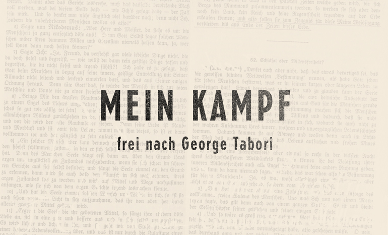
In Urs Odermatts Verfilmung des gleichnamigen Theaterstücks von George Tabori spielt Hitlers berüchtigte Kampfschrift eine zentrale Rolle. So wählten wir für die Titelsequenz Buchseiten daraus als blassen Hintergrund. Auch bei den darüber liegenden Titeln sollte die Druckerschwärze spürbar sein, gleichzeitig aber das Klischee der altdeutschen Schrift vermieden werden. Mit einer Schrift des deutschen Schriftsetzers Jakob Erbar fiel die Wahl auf eine Typografie, die Mitte der Zwanzigerjahre entstand, und ebenfalls Assoziationen zu dieser Zeit weckt.
In Urs Odermatt’s film adaption of the play by the same title by George Tabori, Hitlers infamous combat organ plays a main role. For the opening credits we chose pages from that piece as a pale background and the printer’s ink on the above lying titles should be noticeable, at the same time the cliché of the old german typography was avoided. By sellecting a font designed in the mid twenties by the German typographer Jakob Erbar, we captured the atmosphere of this time.
© 2026 Brigae Haelg – brimp studio | Theme by Eleventhemes